Announcing Email Layouts (Beta): Best Practice Responsive Email Designs
We're excited to announce the beta release of Email Layouts for CloudMailin.
Increasingly, larger email providers are using the content of an email to determine whether it should be delivered to the inbox or not. With our new email layouts feature we're providing some simple email layouts (templates) that you can use to help get started sending professional, well-designed and responsive transactional emails.
Why is email content design important?
As users start to explore our platform, deliverability is always a key question. After all, you chose CloudMailin for its stellar reputation and deliverability rates. Why did my test email end up in spam? Increasingly, the layout and structure of your email appear to be coming into play.
Typically, you’ll start out by creating a simple “hello world” email, and although in most cases it will be delivered, sometimes it doesn't. Those emails that are not delivered are often too similar to the basic emails that have been automated by spammers for years. Using a layout can help make your email more professional from a content point of view and more likely to be accepted.
However, there's a more important reason to consider the layout of your email: your users! A well-designed email can help to increase customer engagement and whilst this is particularly important for marketing emails, it's also important for transactional emails. With the right layout your email will look good across all devices and be easy to read and understand.
Additionally keeping consistent branding across your emails can help to build trust with your email readers (users).
What is email design?
Email design is the process of designing the layout (and content) of your email. It's a practice that's often overlooked by us developers as we just need to get the message sent. However, it's an important part of the process, especially for the reasons mentioned above.
How do I design a good email layout / template?
Designing for email is a complete minefield. When first starting out you'll start to notice tables, inline styles and other things that you thought were long gone. Why are we still doing this in 2024?
The reason is that email clients are notoriously bad at rendering HTML and CSS and although the situation is improving, many email clients are outdated and using old rendering engines (Outlook, I'm looking at you and your use of Word).
Thankfully, we've done the hard work for you and created a set of responsive email layouts that you can use to get started. Not only are these layouts responsive (they work on all devices) but they're also designed to be easy to use and customize.
We've also tested the emails in a range of email clients to ensure they render as expected.
Before we get into how to use the layouts we've provided we'll talk a little more about responsive email and why it's important. If you want to skip ahead you can jump to getting started.
What is responsive email design?
Responsive email design is the practice of designing email so that it looks good across all devices. This means that the same email will look just as good on your phone as it does on your desktop.
Responsive email design ensures that the email design adapts to different devices and screen sizes and remains both usable and readable.
An article from 2023 by Drip states that 46% of all email opens are on mobile devices. Although a lot of the statistics relate to marketing emails and newsletters, we can still draw parallels with transactional emails.
Responsive email design is similar to responsive web design, but with email design, there’s a wider range of email clients and rendering engines to consider than on the modern web.
Responsive email design will generally use media queries to adjust the layout and styles of the email based on the device it's being viewed on.
The same article Drip goes further to state that 28.4% of people open mobile emails on an iPhone, followed by an iPad at 9.3% and Google Android at 2.3%. This means we not only need to design for desktop vs mobile but also for different sizes entirely. That's where hybrid email design comes in.
What is hybrid email design?
Hybrid email design takes the idea of responsive design a little further. It still uses the same fluid tables and images that we would see in responsive design. However, instead of using media queries to trigger those fluid states on smaller screens, hybrid coding favors Microsoft conditional comments to restrain fluid tables on larger screens.
There are a number of elements to consider but the main principles are:
- Fluid tables and elements by default
- Max-width CSS to constrain widths on desktop
- MSO conditional comments to constrain widths in Outlook
You can find a lot more information about hybrid email design and its origins in this article from Litmus.
Testing email design
Testing email design is a little more complicated than testing a website. You need to render the email in a range of email clients to ensure that it looks good everywhere.
We'll not go into detail here but we'd recommend taking a look at Litmus Email Testing or Email on Acid if you want to build and test your own email designs.
Thankfully, we've done the hard work for you and created a set of responsive email layouts that you can use to get started if you're a CloudMailin customer.
Email design practices are constantly evolving, but we’re keen to help you get started with the right best practice email layouts.
How do I get started with CloudMailin's responsive (hybrid) email Layouts?
Our best practice email designs allow you to get started sending professional, well-designed and responsive hybrid transactional emails.
In order to use the layouts you'll need to be a CloudMailin customer. We’ll probably open-source the layouts in the future, but currently, they’re only available to our customers.
For the rest of the article we'll assume you're a CloudMailin customer and opted into the beta if needed.
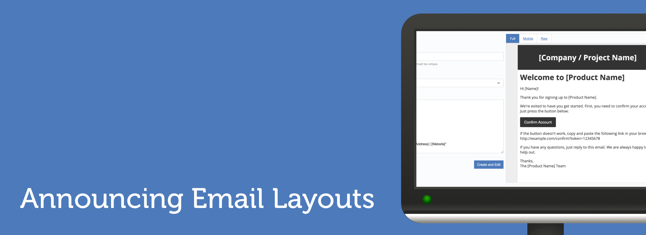
Creating an email layout
To get started we'll head to email layouts in the navigation:

From here we can create a name for our layout and select from one of the two designs we've provided. You can also modify the JSON configuration for the layout.
The configuration allows you easily set colors, such as the header and background and some of the text such as the header text and the footer text.
The footer is a great place to add your address, a link to your website and any other relevant information that would help identify your business and make your email more palatable to email filters.
Although the can-spam act primarily relates to marketing emails and we only allow sending transactional email it's still good practice to include full contact information.
Modifying the hybrid email layout
Once you have saved the email layout you can continue to modify the JSON configuration and also the RAW HTML of the layout template itself.

Using an email layout
Once you've created your email layout it's as simple as adding a header to your
email. You can do this by adding the x-cloudmta-layout email header via
SMTP or using our API.
... other email headers
to: user@example.com
subject: hello
x-cloudmta-layout: my_layout

... email content
The name of the template will show once you have saved it as a parameterized value suitable for inclusion within the email header to select the layout.
Default layouts for all emails
CloudMailin also allows you to set a default layout for all emails sent from CloudMailin or from a single outbound account.
When you name the email layout you can use one of the special names in order to set it as the default layout for all emails sent.
all_default- sets the layout as the default for all emails.ACCOUNT_USERNAME_default- sets the layout as the default for all emails sent from a single outbound account.
Here ACCOUNT_USERNAME is the username of the account within your SMTP or API credentials.
The designs
At launch we've provided two hybrid email layouts to get started:
Both of these designs are fluid and will work across all devices. Hybrid is a nod to the concept and so we named it after that. Plain is just a simpler layout with no header that is again fluid and responsive across all devices.
Hybrid

Plain

The future of email layouts
We're excited to see how you use the layouts and what you think of them. We have plans to continue to expand and test the functionality.
We’d love to hear how you’re utilizing these new email layouts. Share your experiences and feedback with us!